
NAVIGATION REDESIGN
Increasing Conversion From New Customers
As we were looking for ways to increase conversion, we noticed a high percentage of abandoned sessions on our website. Looking more in-depth on Lucky Orange we found these abandoned sessions were coming mostly from new customers. We explored ways this could be improved.
Internally we had been wanting to make some changes to our navigation. I wondered if there could be an opportunity to update the nav to increase conversion rates as well.
EXISTING NAV
WHAT ISN'T WORKING
The original navigation pictured here wasn't giving customers the full story. A lot of the abandoned sessions were happening after using the nav then scrolling through pages and pages of product. With more than 100 skews of baby moccasins we needed a way to filter down our product lines to get new customers onto correct product pages quicker.

EXPLORATION
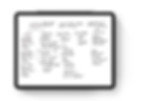
TAKE NOTES

I then took a screenshot of the existing navigation and took notes on it.
POSSIBILITIES
BREAK IT DOWN
After organizing my thoughts/notes I broke down two possible solutions:
SOLUTION 1:
Keep the overall structure of the current navigation while adding more subcategories for new customers, keep the icons.
STRENGTHS:
-
It’s familiar to our current customers
-
The icons are unique
-
The customer structure allows for customers to come to the site and know where the products are for who they’re shopping for
WEAKNESSES:
-
The icons are slowing down our site by 10-20 seconds
-
There isn’t much more real estate on desktop to expand into more product categories
-
The subcategories are too broad-customers will be scrolling through pages of product
SOLUTION 2:
Organize the navigation by product type rather than customer type with more in-depth subcategories, ditch the icons.
STRENGTHS:
-
Allows for broader subcategories
-
Allows for more visual real estate to accommodate new product lines
-
Clearer pathway to access products for new and returning customers
WEAKNESSES:
-
Returning customers could be more accustomed to the old navigation
-
Potential for wrong/unclear verbiage
-
Have to rely on verbiage rather than icons to communicate products
SOLUTION 2
MORE NOTES
After reviewing the solutions with my team, researching how other sites such as Nordstrom, Baby Cubby, and other relevant websites are structured we decided to go with solution 2. I then sketched out what a rough flow would look like.
FINAL PRODUCT
TESTING & LAUNCHING
Once we came up with the subcategories I created a quick flow to see how it all worked. You can view the mobile prototype here. We agreed to test this new navigation against the current one using Invision at first then A/B testing them to our audience live on our site. I provided the developer with the Invision prototype and detailed Sketch files and they were able to execute it as we envisioned it. You can view the live site here. This design has outperformed the original and has resulted in an increase in completed orders which has increased revenue.

